Sometimes a composition is quite busy and it's hard to isolate focus on the main subject. Using selective color to make the subject stand out can not only quiet down the image but also add add an element of contrast to the scene. Let's look at several examples.
A Car
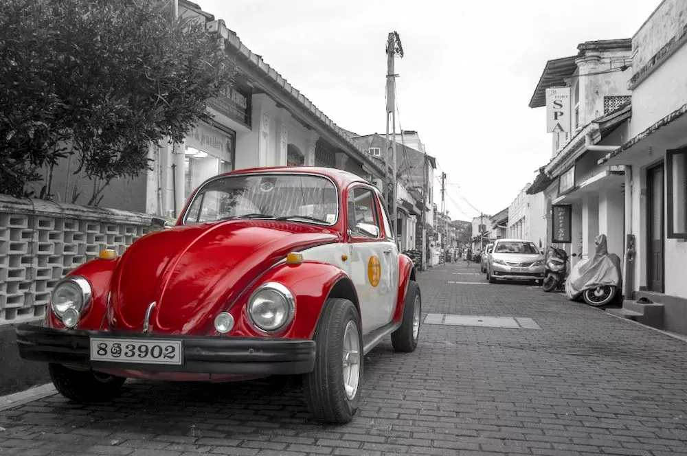
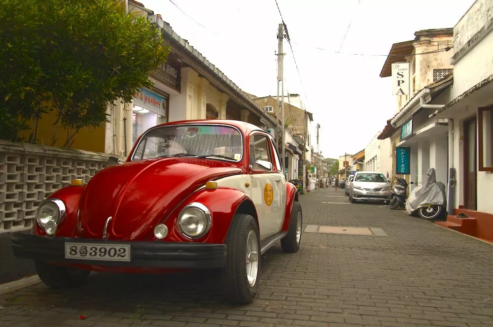
In the above picture, the car doesn't stand out very well due to all of the other details in the scene. Moreover, the colors in the rest of the scene aren't very important. To help direct focus to the car and make it stand out, use an instance of the color calibration module with a drawn mask to select the general area around the car and a parametric mask to select just the color of the car. Note that it's crucial that you also set combine masks to exclusive & inverted which will invert the selection we have made to select everything except for the car:
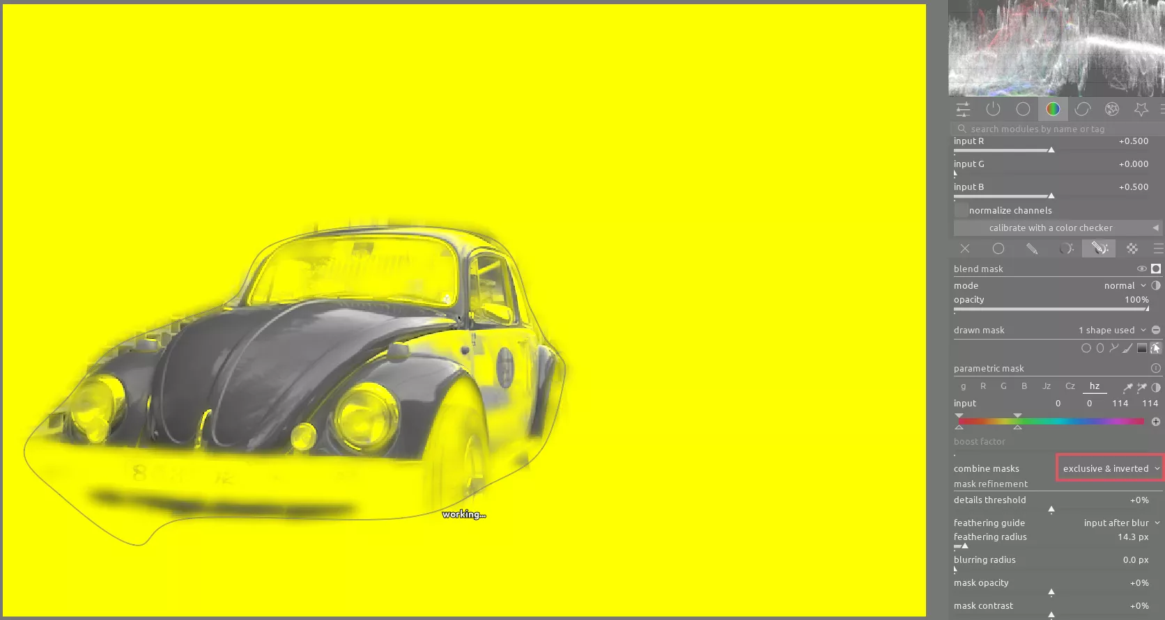
Once you have the mask created, use the sliders on the gray tab to desaturate the rest of the image. It's important to experiment with the mix if these sliders to find which mix of each channel gives you the best contrast between the parts of the scene. Finally, you can use the retouch module to clean up the power lines in the sky, yielding a less busy image where the eye is much more easily drawn to the red car.
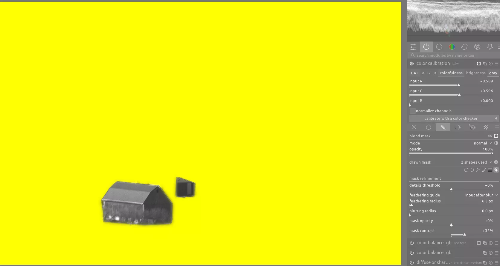
A Barn
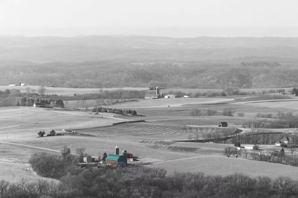
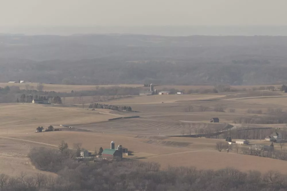
In this example, we can apply the same technique to isolate the barn from the other buildings dotting the landscape. In addition, we can easily push the contrast in black and white, yielding an image with more "punch" while also clearly defining the intended subject. In this case, the mask is simply a drawn mask around each building with mask contrast set high to clearly define the edges of the buildings:
A Sign
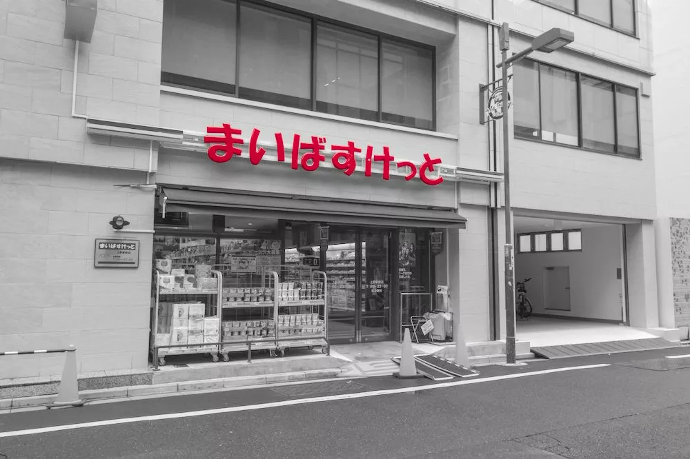
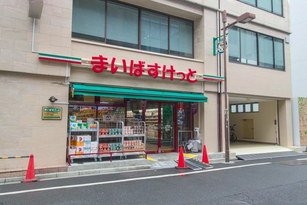
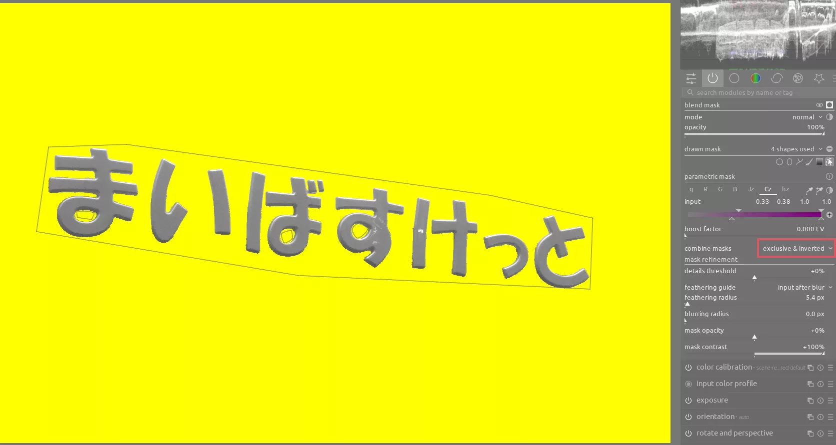
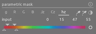
This sign is interesting, but similar to the car scene it is too closely tied to other red parts of the image (like the traffic cones). Applying the same technique yields much better subject isolation. The masking here is trickier, where we not only need to create a drawn mask and parametric mask, but we also need to only select the right-hand section of the Cz slider in the parametric mask in order to only select the letters in the sign themselves and not the red reflection from the letters on the wall behind:
For reference, here are the colors selected in the parametric mask as well:
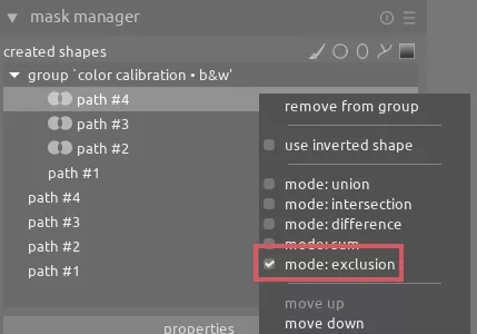
Finally, we need to make separate drawn masks inside the "circle" part of 3 of the characters. Once we have these masks created, we need to go the mask manager, right click on each of these masks, and select mode: exclusion:
Tip
Sign up on our Patreon to get access to this RAW file and XMP if you want to play with all of these different mask settings
Here's a video showing the other settings on this image:
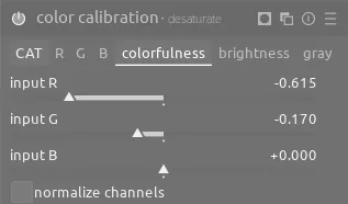
A Flower
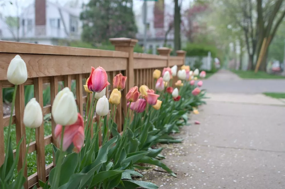
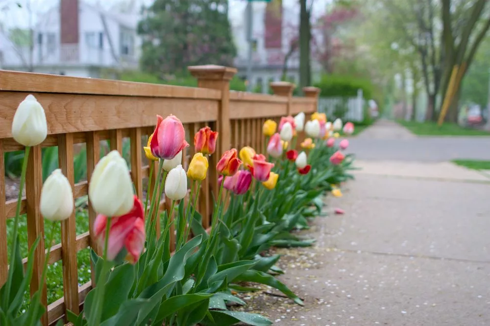
You can use selective color not just with black and white, but also to reduce the saturation of surrounding busy elements to make the subject stand out because of its greater saturation. Once again create a similar mask:
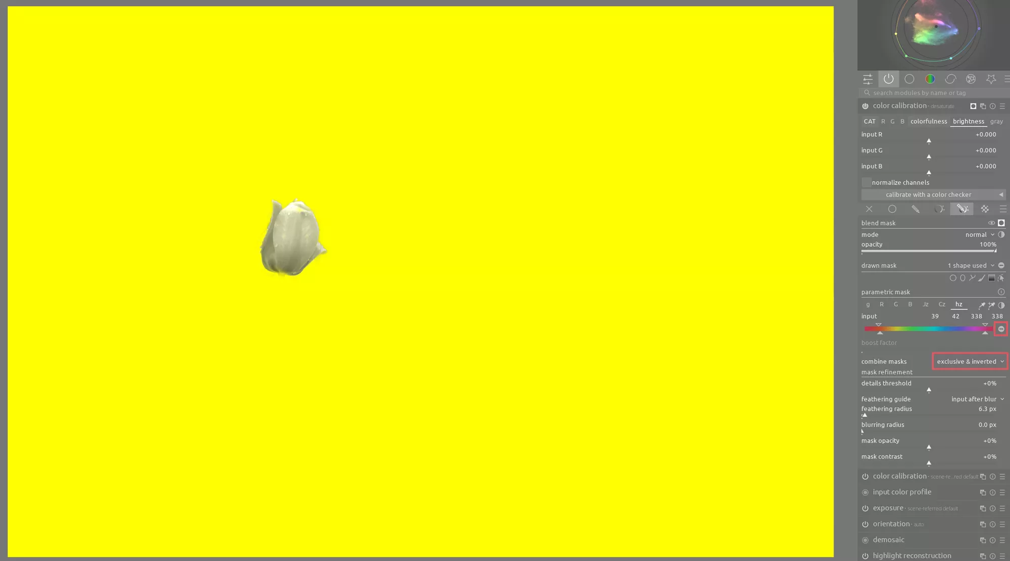
The difference here is rather than using the sliders on the gray tab of color calibration, use sliders on the colorfulness tab to reduce the saturation around the subject: