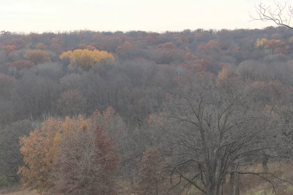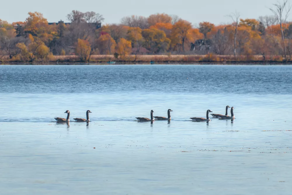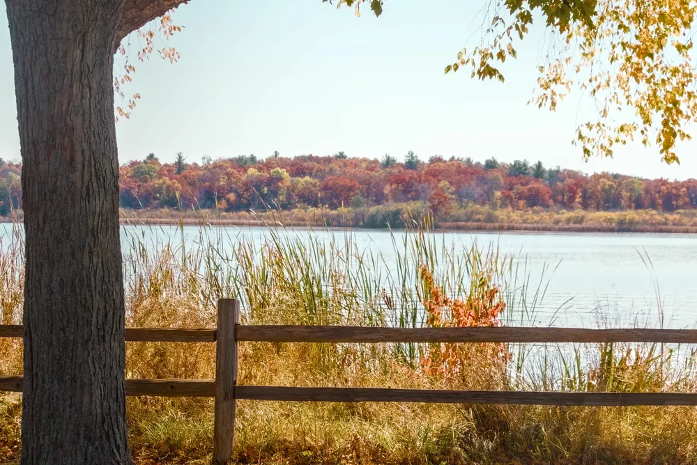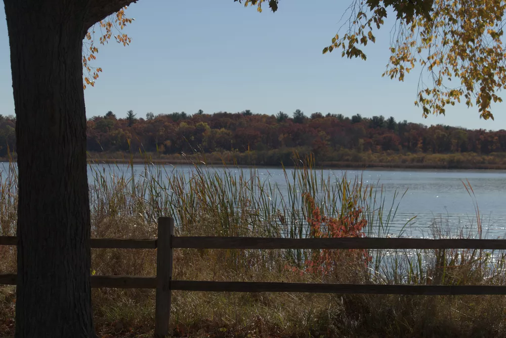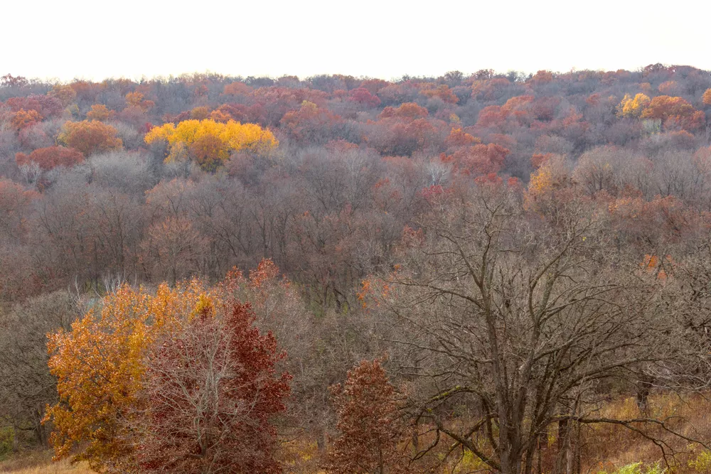
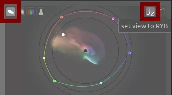
Fall colors are a great opportunity to utilize analogous and complementary color harmonies in a scene. Let's see how to use the RYB color wheel to create a color harmony and bring fall scenes to life. For each of these photos, make sure you've selected the vectorscope button in the scopes module and then click set view to RYB:
For more information on color theory and color harmonies, see this video.
Analogous Color Harmony
There is a lot of analogous color in this scene, but we need to increase the chroma to bring it towards the edge of the color wheel:
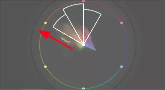
The result is the same analogous color harmony but with more saturation, making the colors really pop:
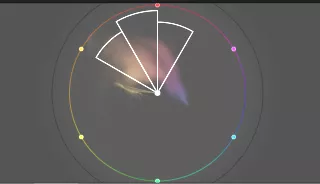
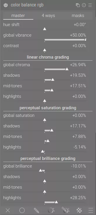
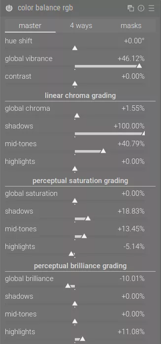
To do this, increase the global vibrance slider and the sliders under linear chroma grading and perceptual saturation grading in color balance rgb:
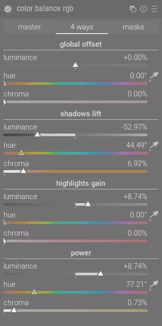
Once that is done, add some orange to the shadows on the 4 ways tab using the shadows lift section and some yellow to the midtones on the power section:
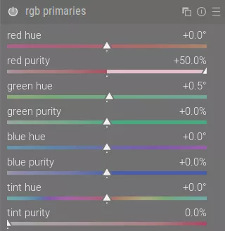
We can also use the rgb primaries module to increase the purity of the red channel, which makes the reds and yellows pop a bit more:
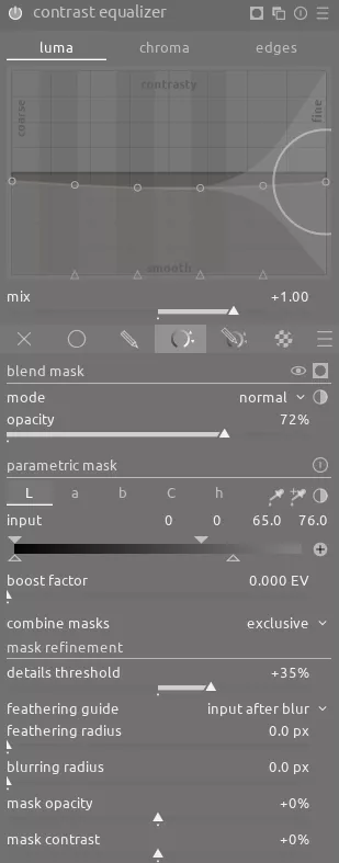
Finally, we can soften some of the small details of the darker parts of the image with the contrast equalizer module:
The resulting image has a lot of interesting color by accentuating these colors in the analogous color harmony.
Complementary
Fall is great time to shoot scenes with water because the blue of the water acts as a natural complementary color to the oranges and yellows in the trees. In this scene, we'll use a complementary color harmony:
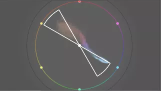
First, we can use rgb primaries to shift the blue channel slightly to align it with the harmony guidelines:
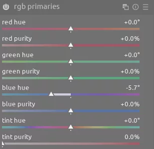
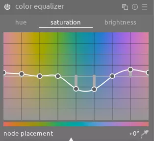
Next, we can increase saturation on the oranges and reds with color equalizer:
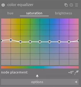
Finally, color balance rgb provides a standard color boost:
We also want to draw attention to the geese on the water, so use another instance of exposure with a drawn mask to darken the rest of the image and draw your attention to the birds:
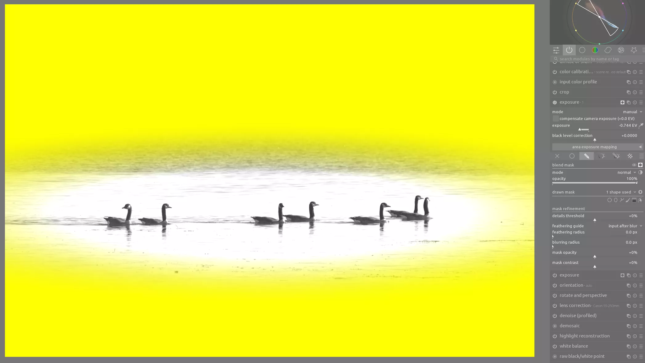
These subtle adjustments add up to a significantly better image.
Analogous Complementary
In this scene, we put it all together by utilizing analogous colors and complementary colors together. We use rgb primaries to adjust the colors again to fit within the color harmony guidelines:
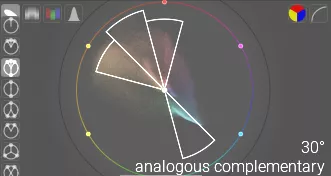
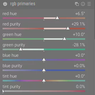
Also, reducing the green purity slider allows the grass to take on a more yellow appearance, which I think is more pleasing:
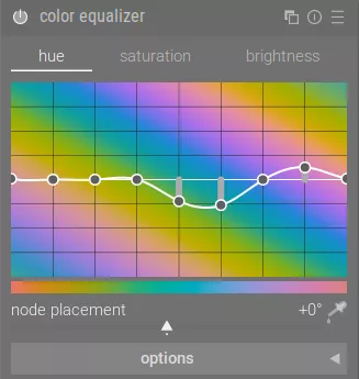
Similarly, in the color equalizer module we'll adjust the hue of the blues to be within the color harmony guidelines and reduce saturation on the blues:
Finally, we use color balance rgb as usual to give a chroma boost to the overall image:
Conclusion
Fall colors offer a unique opportunity to work with analogous colors. Moreover, introducing water elements into your fall scenes allows you to create easy complementary harmonies which naturally match the oranges and yellows of changing leaves.

