We've discussed a number of different ways to adjust colors in darktable, including color balance rgb, the channel mixer in color calibration, rgb primaries, and color equalizer. In the upcoming 5.6 release of darktable, a new module called color harmonizer makes it easier and more intuitive than ever to adjust an image to match a color palette. Let's review some examples of how to use this exciting new module.
Module Overview
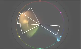
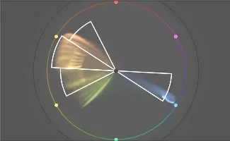
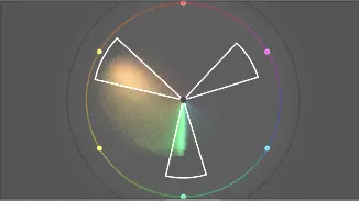
For several releases now, darktable has had the vectorscope scope which shows the colors in the image on a color wheel and allows you to overlay a color harmony. While this has been useful to reference when making color adjustments, now you can directly adjust the image to the desired harmony using the color harmonizer module. For example, take this color wheel and the tetrad harmony:
You can use color harmonizer to easily shift the oranges and greens into the harmony:
Moreover, we can even adjust the saturation for an individual color in the palette, like increasing the green saturation, which pushes it towards the edge of the circle:
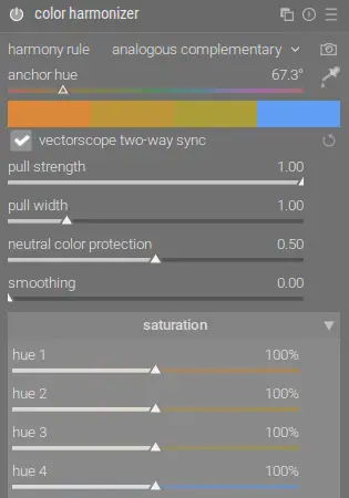
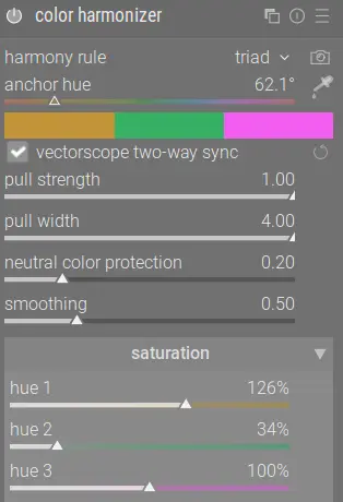
Here are the settings in color harmonizer to achieve these effects:
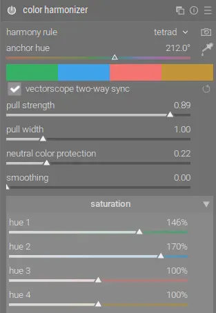
Working from top to bottom, you first need to select the desired harmony rule, or click the camera icon to automatically pick the harmony that best fits the image. Changing these settings will adjust the overlay on the vectorscope. You can then use the anchor hue slider to rotate the harmony around the color wheel. Alternatively, you can change the harmony and rotate the overlay on the vectorscope and have those changes reflected here in the module if that is easier.
The pull strength slider determines how much a color (hue) will be shifted in order to align with the harmony. Similarly, pull width determines how far away a color can be from the harmony for it to be included in the rotation. These do NOT affect saturation.
To reduce any distortions or harsh edges that are created by high values for the above sliders, use neutral color protection (shields low-chroma pixels from adjustment) and smoothing (makes the transitions softer).
Once the colors are aligned with the harmony overlay, you can independently adjust the saturation of each part of the harmony. In this example, we want to increase the saturation of the greens and the blues while leaving the reds and oranges alone. This is easily done with the sliders in the saturation section.
Now that we understand how the module works, let's look at a couple examples.
Sky Adjustment
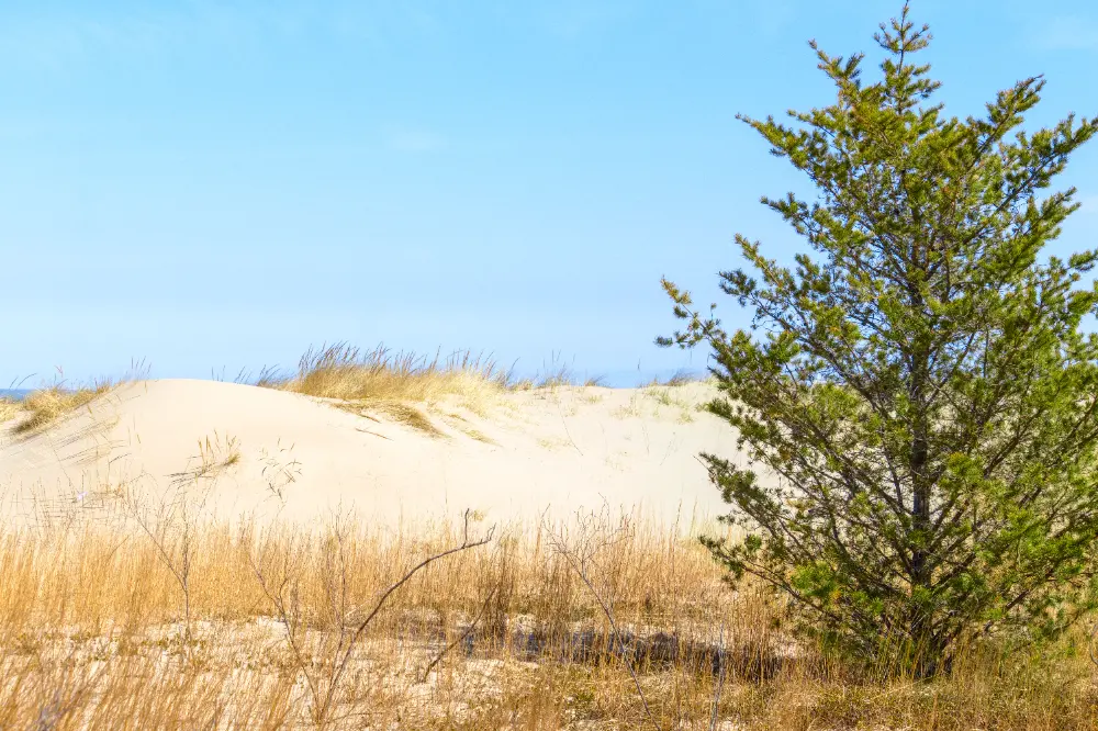
This difference can be hard to see, so in the above "before" photo, I've intentionally over-saturated the sky so the change is more obvious. The problem with this photo is the blue of the sky is not within the analogous complementary harmony, but just outside it:
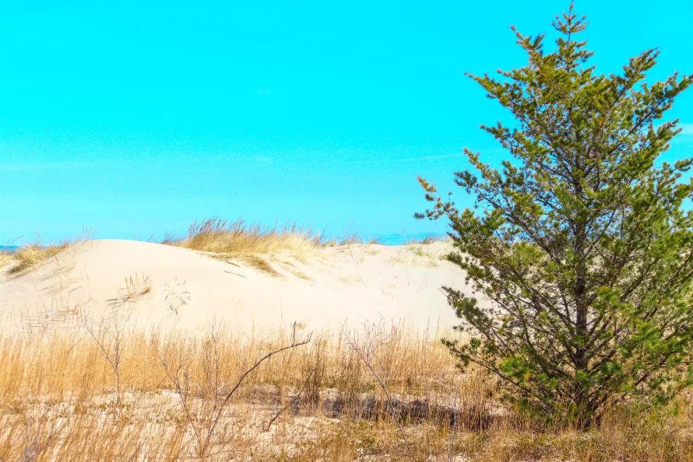
We can use pull strength in color harmonizer to correct this:
The result is a more natural-looking sky color that fits within the harmony:
Note that the green is largely unaffected because it's too far from the harmony overlay to be rotated. It's hard to see in the above sRGB image, but the sand color is also a more pleasing orange instead of the washed out yellow that it was originally.
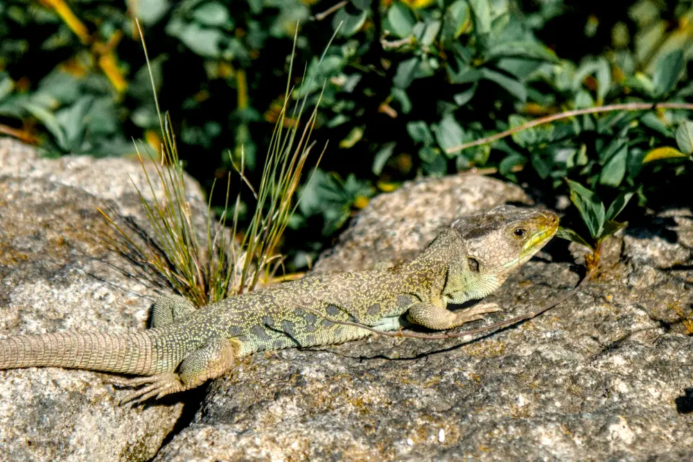
Foreground and Background
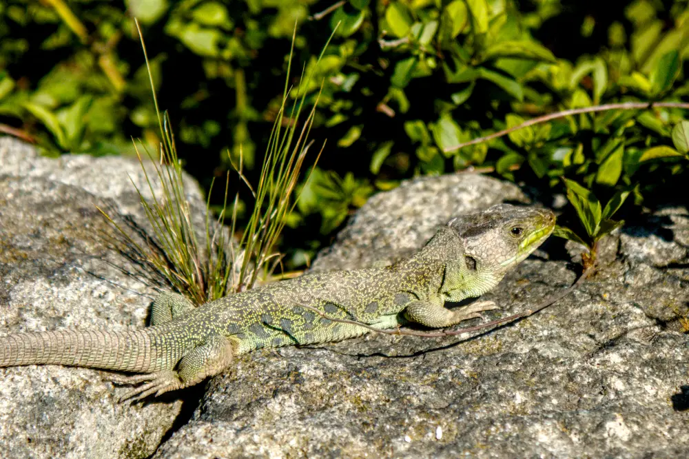
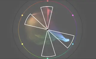
In the "before" photo above, the lizard and background are the same color so it blends in with the scene. Looking at the color wheel, you can see distinct areas of color in the yellows and greens, but also a lot of overlap between them:
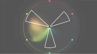
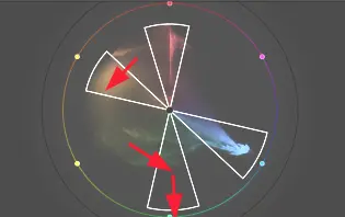
Let's use color harmonizer to separate out these two colors and make them more distinct:
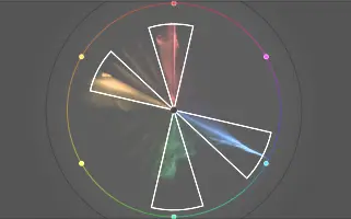
The result on the color wheel is clear:
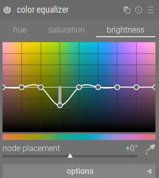
Combine this with darkening the green background using color equalizer and now the lizard stands out better:
Note that even though this image has no magenta, the triad harmony rule can still be used.
Conclusion
While there are numerous ways to adjust colors in darktable, I've found color harmonizer to be much more intuitive than any other method. I look forward this this incredibly useful new module coming soon in darktable 5.6!