
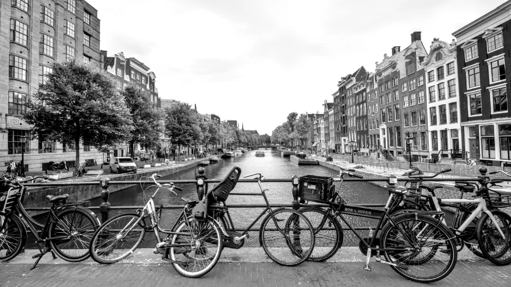
In this image, we are using an instance of the LUT 3D module with the Kodak T-Max 400 LUT from RawTherapee to convert it to black and white. The above version is good, but you can create many more moods and styles by adding color back in after converting to black and white. Let's review some examples below.
Setup
In all of these examples, we're using an instance of color balance rgb, but we're using CTRL+drag to move it after the instance of LUT 3D. This ensures that the colors it adds are after the image is converted to black and white:
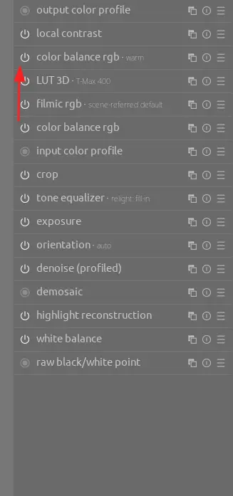
In all cases, we're working with the 4 ways tab.
Warm
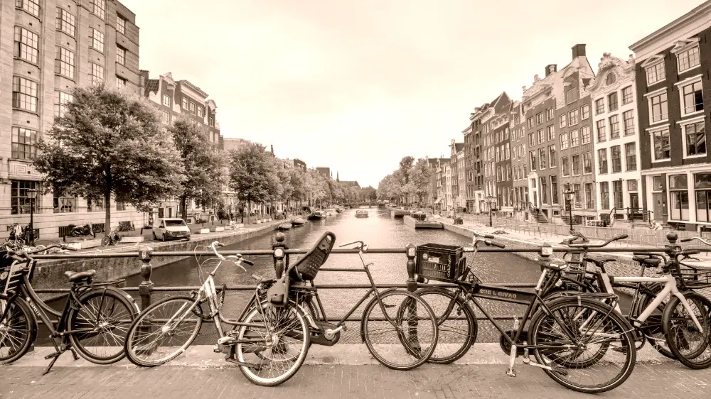

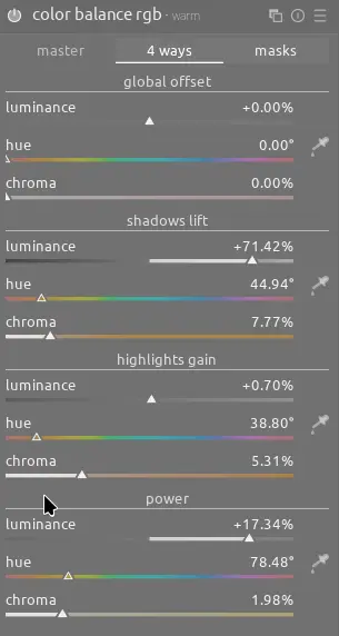
This variation adds orange to the shadows and highlights and a lighter yellow to the power (midtones). Moreover, it increases the luminance slider for both the shadows and power:
Cold
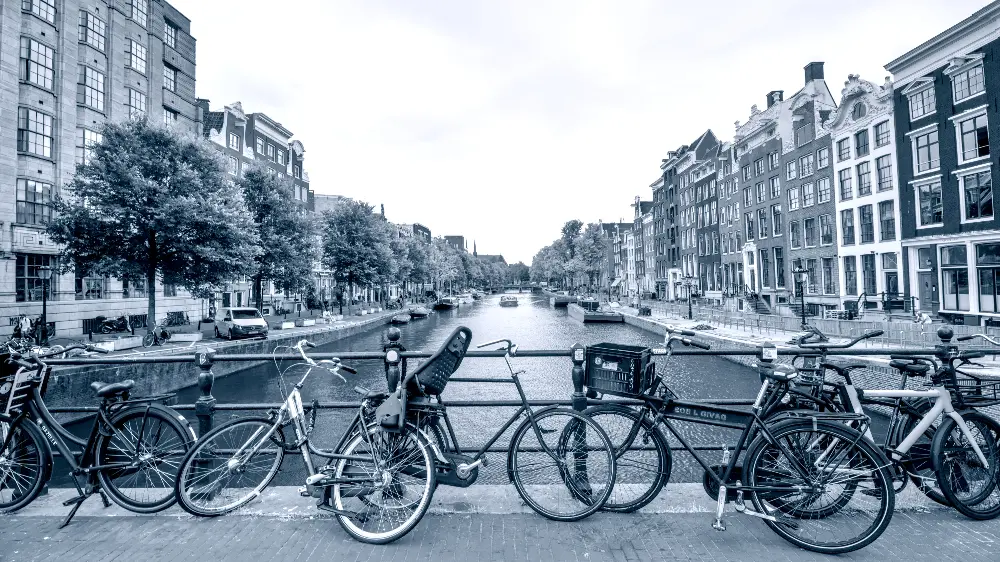
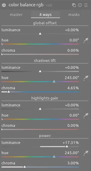
This cold version has a crisp and distinct look from the original black and white image. In this case, we use blues in the shadows and power as well as an increase to the luminance slider for the power. Note that the highlights should remain unsaturated since the darker clouds are already picking up enough color from the power slider:
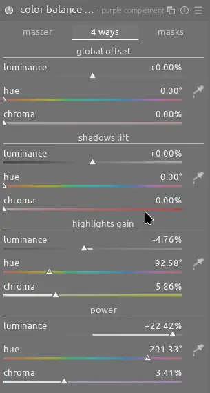
Purple Complement
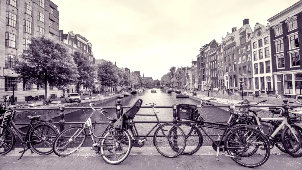
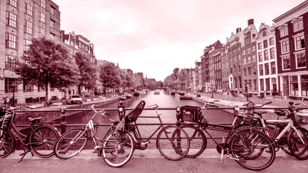
This variation uses a complementary split tone - purple in the power and yellow in the highlights:
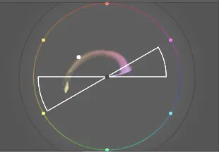
In this case, we don't need any color in the shadows and can let the pure black add contrast to the scene. Note also the adjustments to the luminance sliders once again:
Red
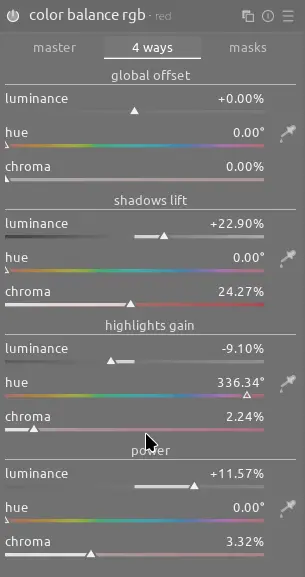
This version uses progressively lighter shades of red for shadows, power, and highlights as well as luminance adjustments for all of them. Note that the chroma slider is adjusted more for the darker tones since colors appear to desaturate as brightness increases:
Sepia
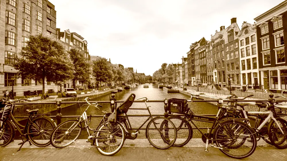
Finally, the classic sepia look. In this case, if we apply the instance of color balance rgb globally, the color in the sky is too strong so we can use a parametric mask to only select the buildings and then a drawn mask (gradient) to include the sky but at a reduced opacity:
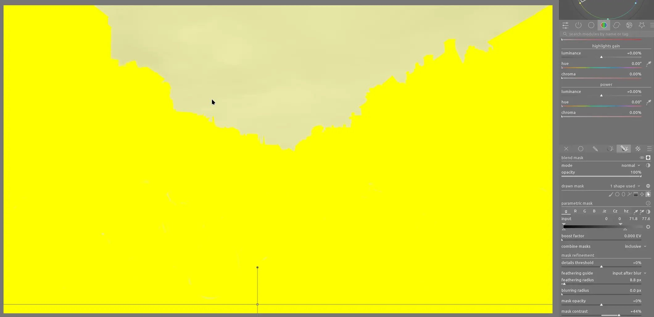
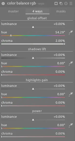
Note also how combine masks is set to inclusive so both masks are blended together. After creating the masks, this time we can use the global offset sliders to apply the brown sepia color to the whole image:
Conclusion
A conversion to black and white is really only the beginning - consider adding a tint, split tone, or other color combination after the black and white conversion to add additional mood and tone to your images.