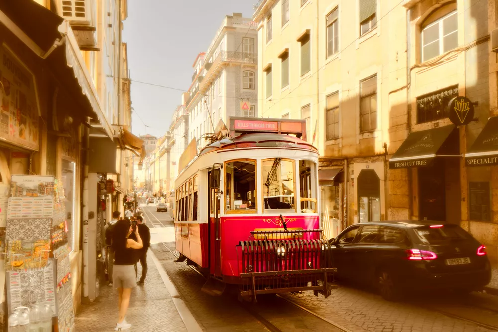

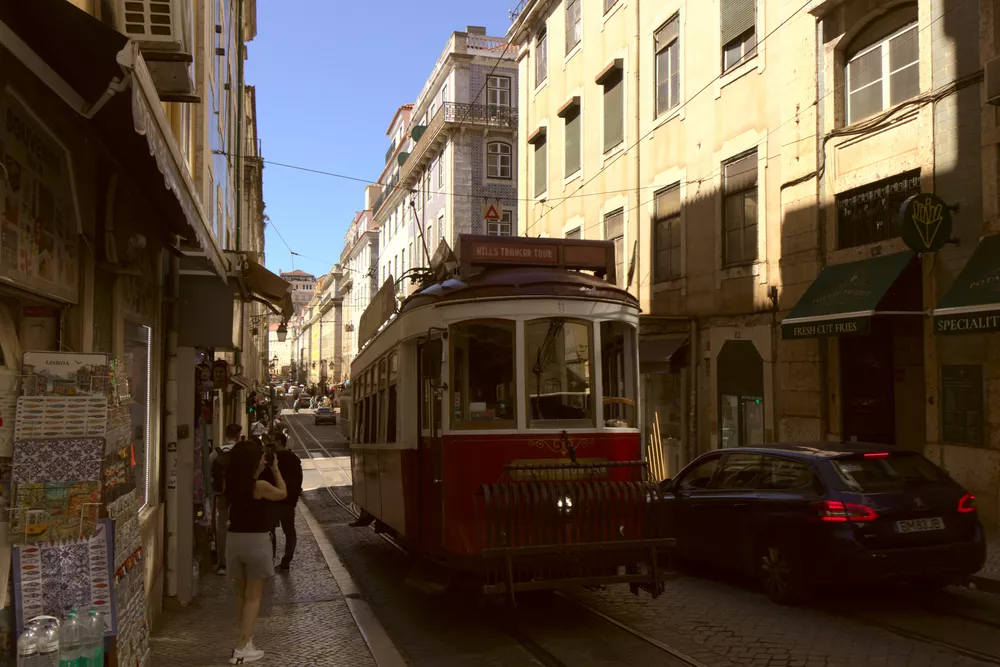
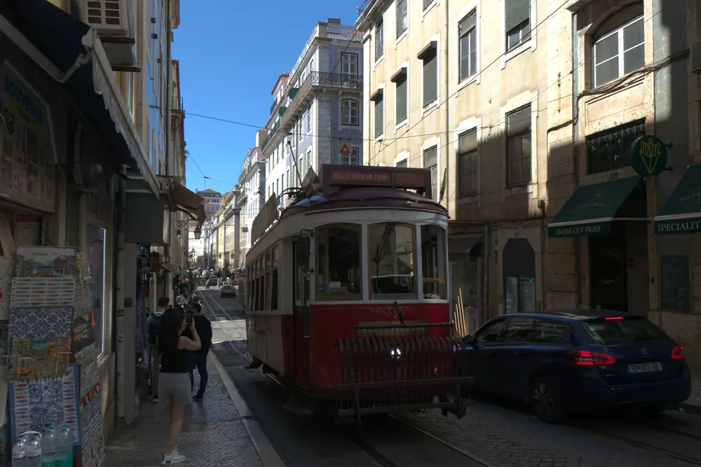
When your subject is old and historic, it may be desirable to give the entire image an aged, analog look. Using the color wheel, let's explore how to create an analogous color harmony and give and old-time look to this photo.
Exposure and Contrast
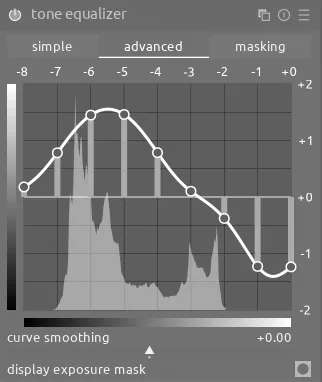
Before adjusting the color, let's use tone equalizer to brighten the shadows and darken the highlights, reducing the overall contrast:
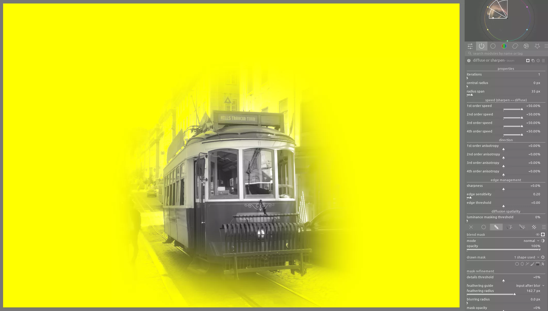
Moreover, we want to place the emphasis on our subject, the red tram, so let's use an instance of diffuse or sharpen with the bloom preset and a drawn mask to soften the edges and details on the surrounding buildings:
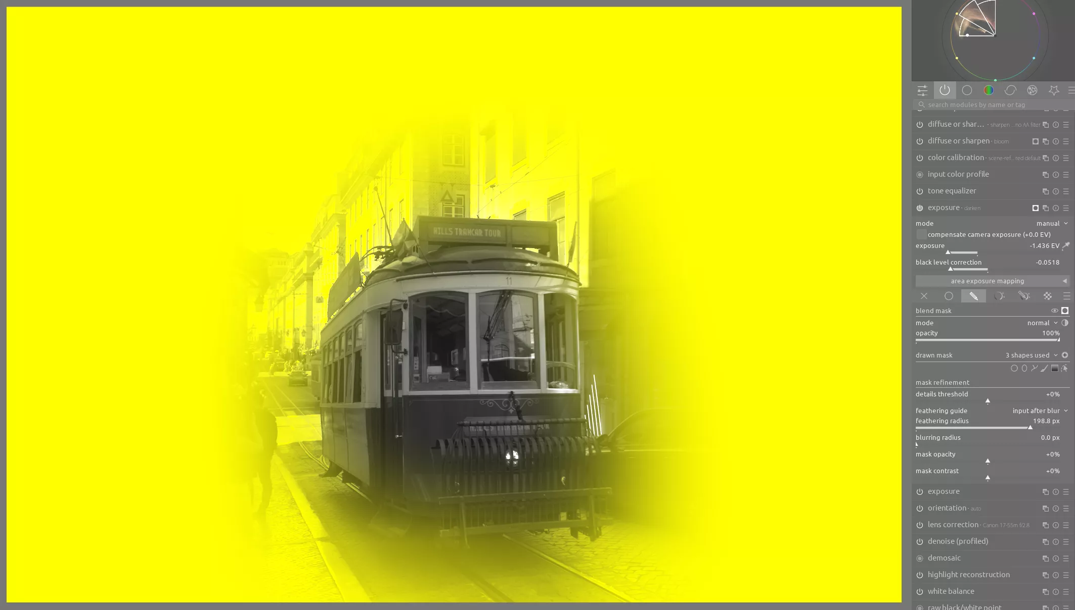
Finally, we want to reuse this same mask and darken the areas around the tram using another instance of exposure. In particular, we want to reduce the contrast in the shadows to better mimic an old photograph; we can easily do this by pulling down the black level correction slider:
Color
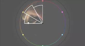
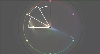
Below is the original color wheel for this image (left), which we want to transform to the analogous color palette (right):
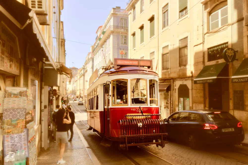
What we want to do is compress the yellows, oranges, and reds to fit within the palette and then increase their saturation. At the same time, we want to reduce the saturation on any greens, blues, or purples. First, let's use an instance of colorize to push everything towards orange:
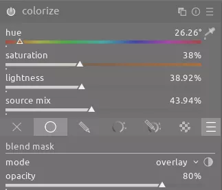
This has the following effect:
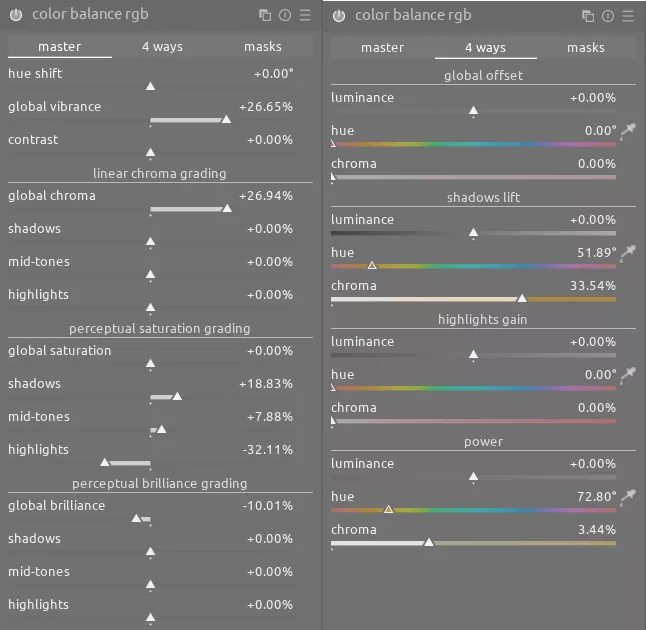
Next, let's enhance the overall saturation and further reduce the contrast with color balance rgb; we'll also continue adding an orange tint to the whole image:
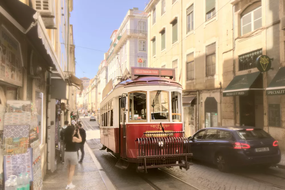
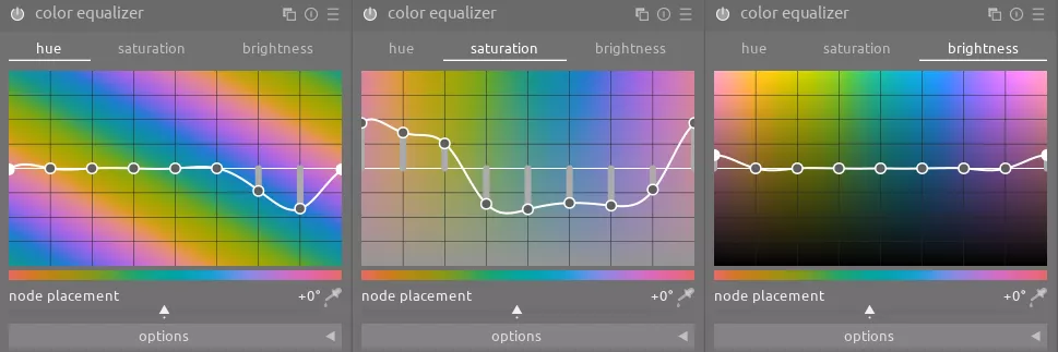
Finally, we will use the powerful color equalizer module to make a number of adjustments:
- compress the hue of all blues and purples towards a single color
- desaturate everything except the analogous colors we want to emphasize
- increase the brightness on the reds to highlight the tram
You can see these adjustments below and the before/after affect they have:
The cumulative result of all of these changes is a dramatically different image from the one we started with that gives an analog look and emphasizes the main subject.